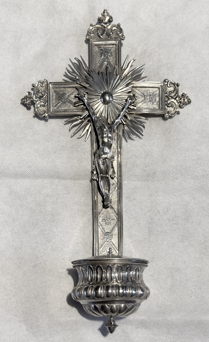



Ghent, 1775, Household Holy Water Font, Solid Silver, Philippe Le Clerq
Silver Domestic Holy-Water Font — Ghent, 1775
Philippus Josephus Le Clercq
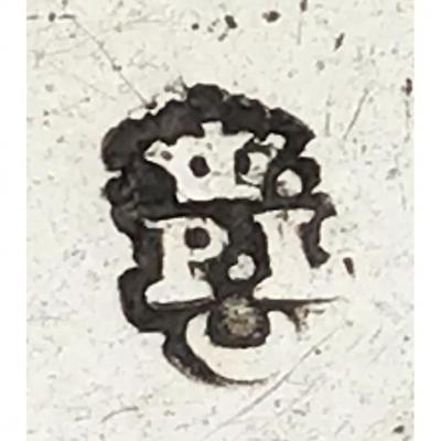
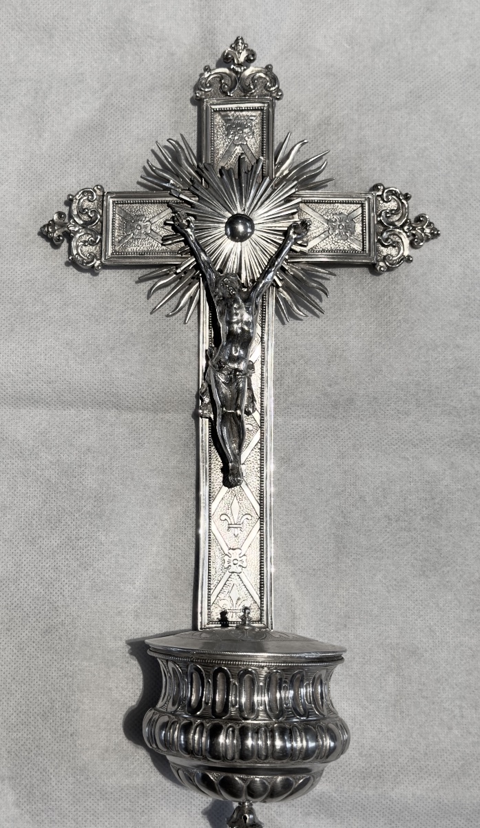
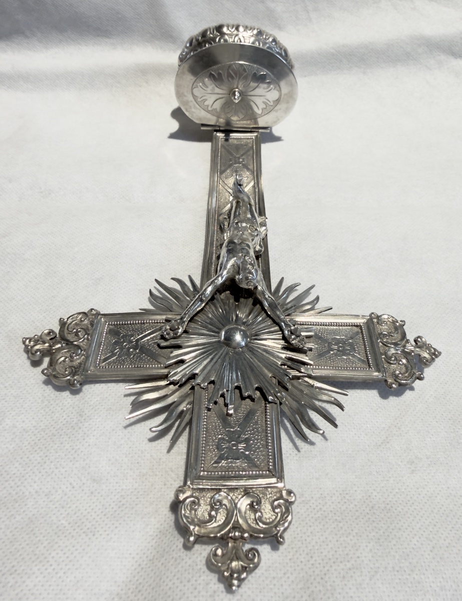
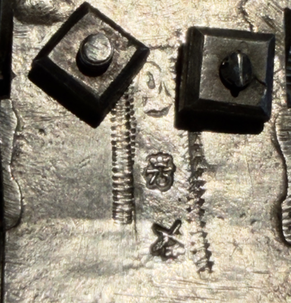
This remarkable solid silver domestic holy-water font bears the marks of the Ghent silversmith Philippus Josephus Le Clercq, together with the city marks of Ghent allowing it to be dated to 1775. It measures approximately 28 cm high, 15 cm wide and 5 cm deep.
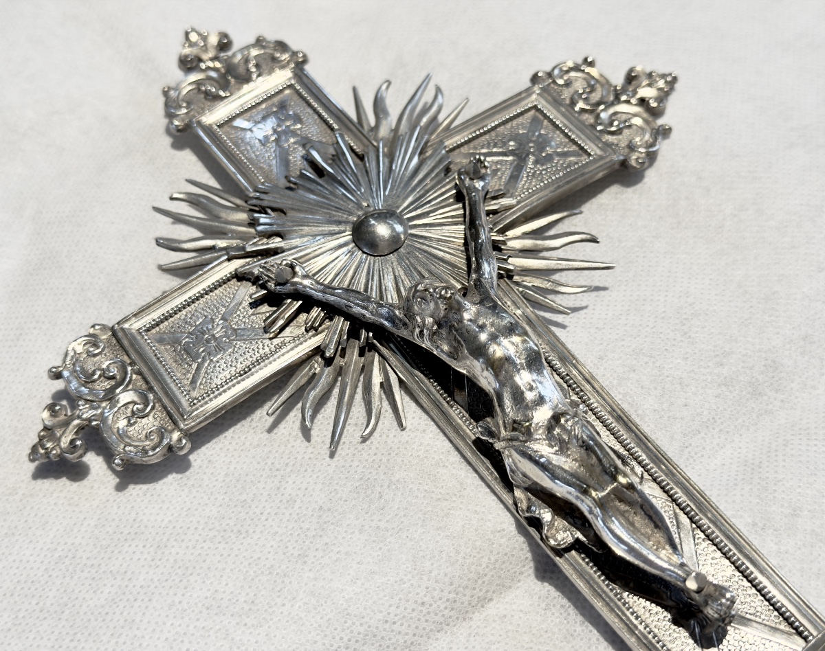
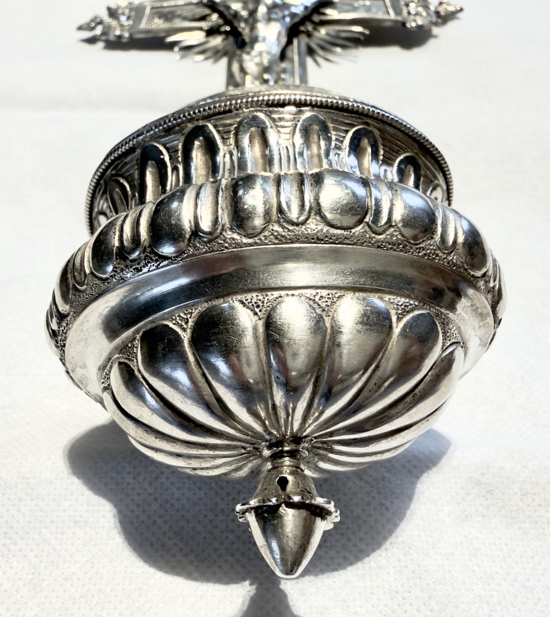
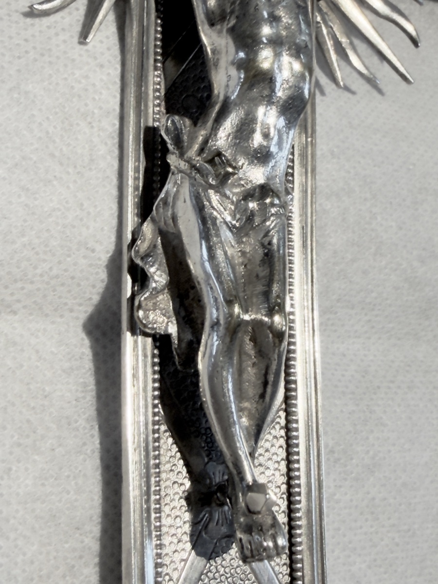
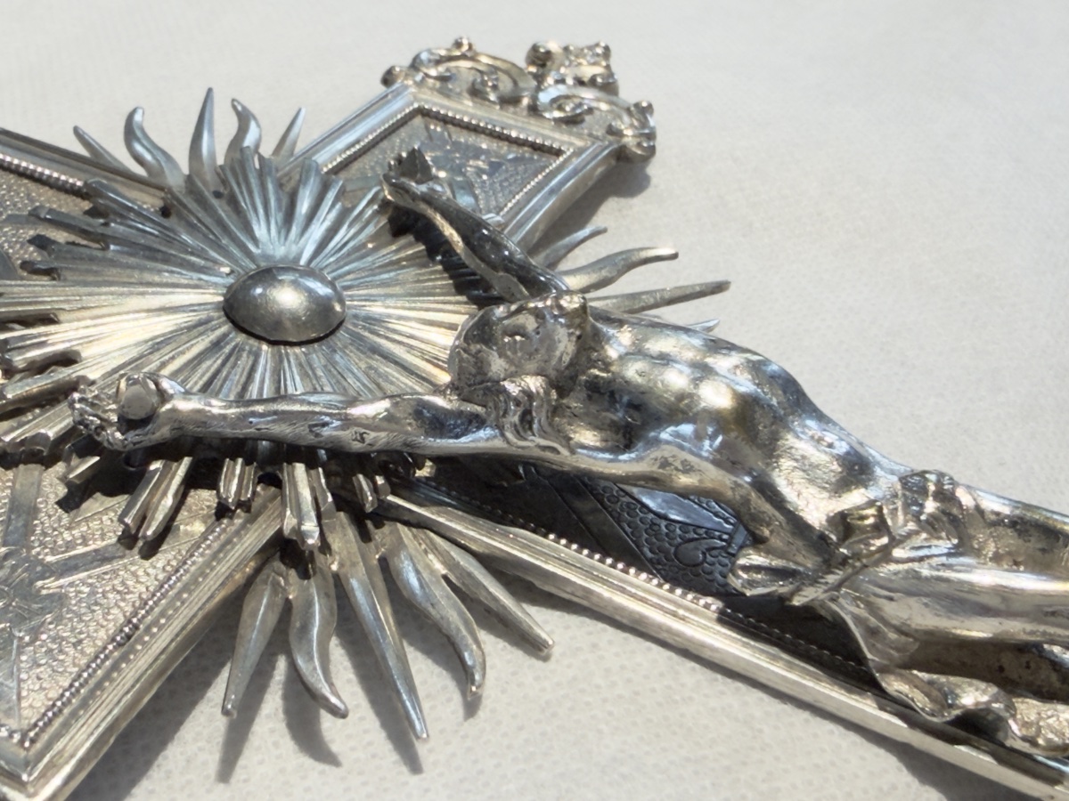
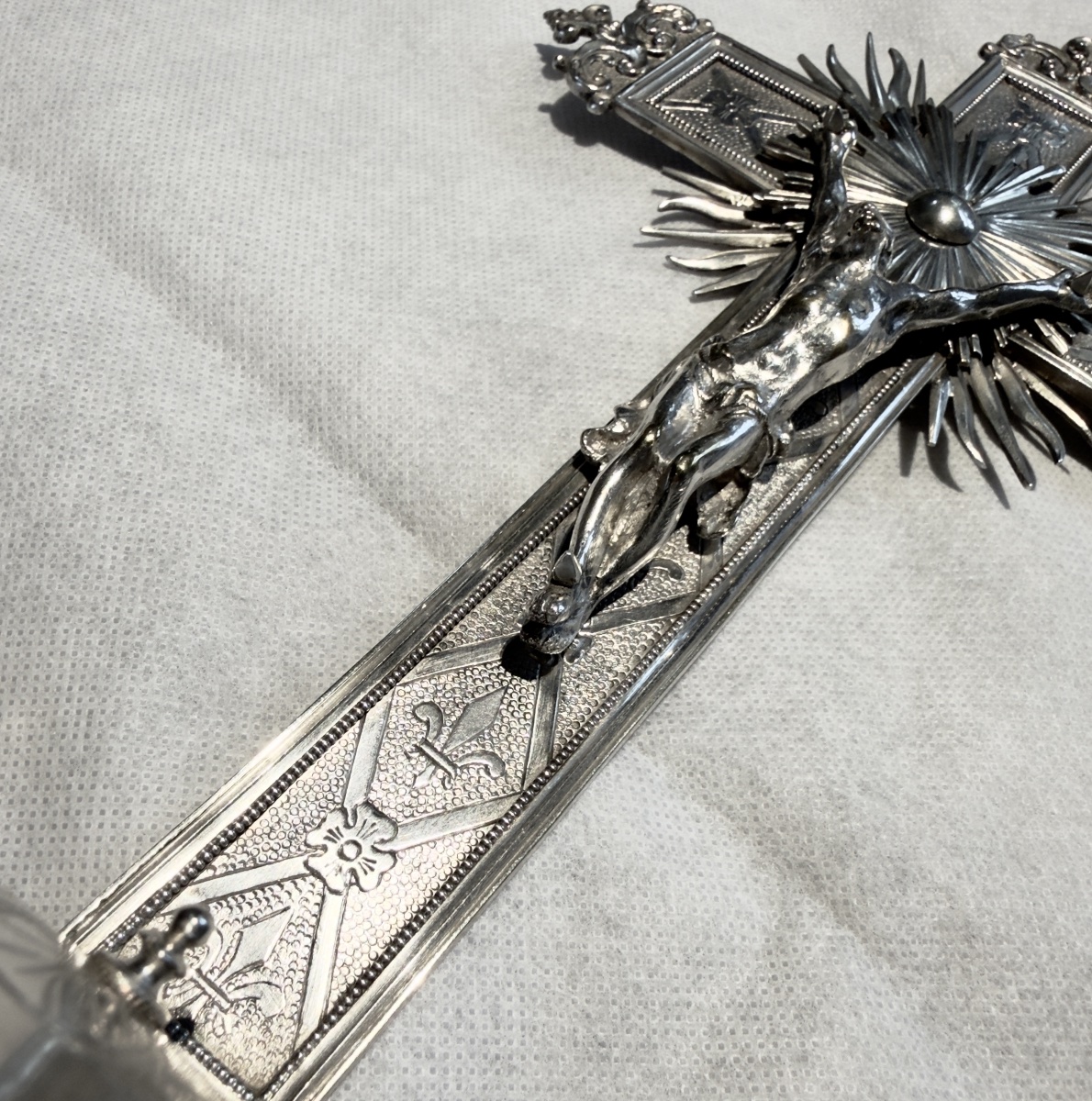
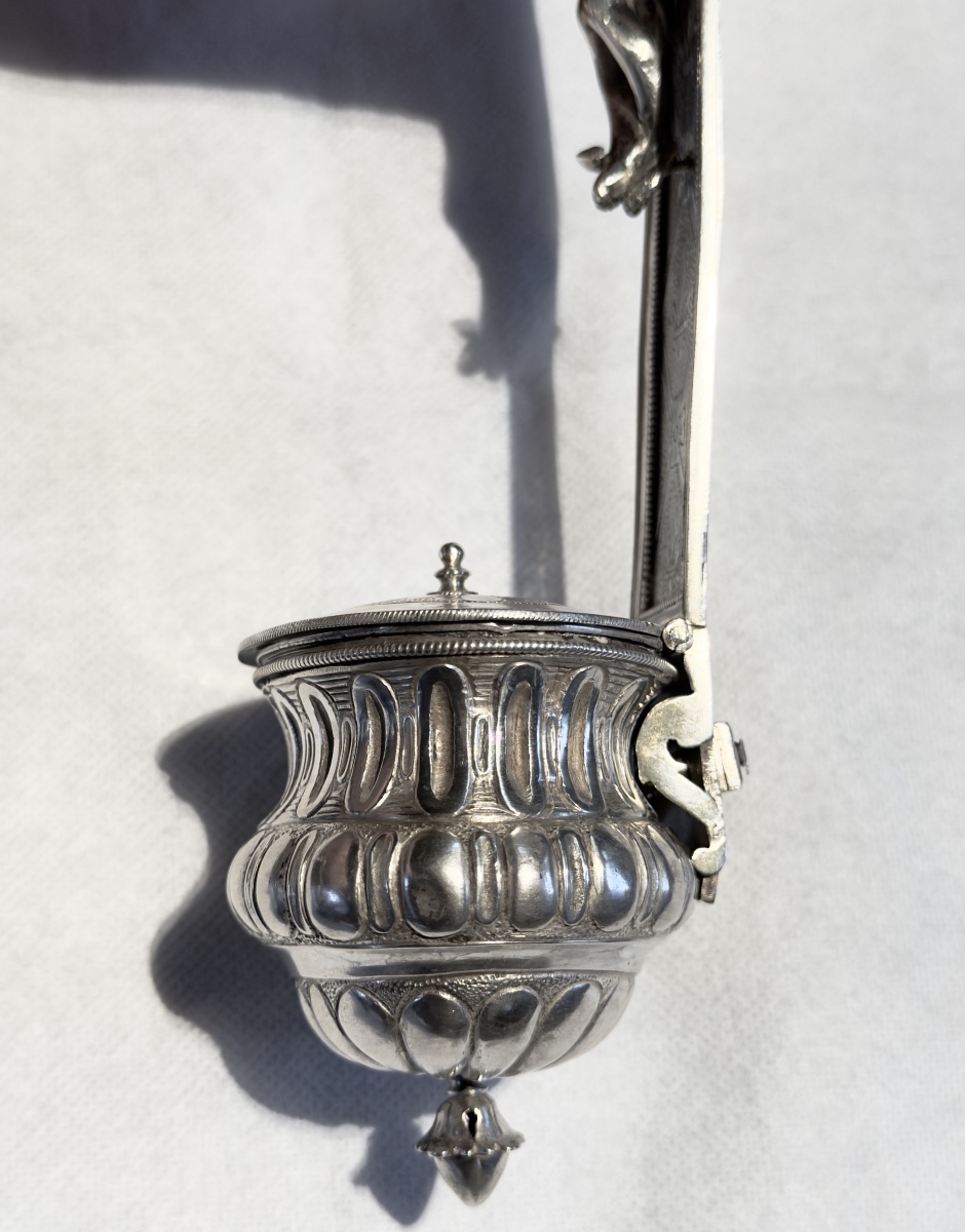
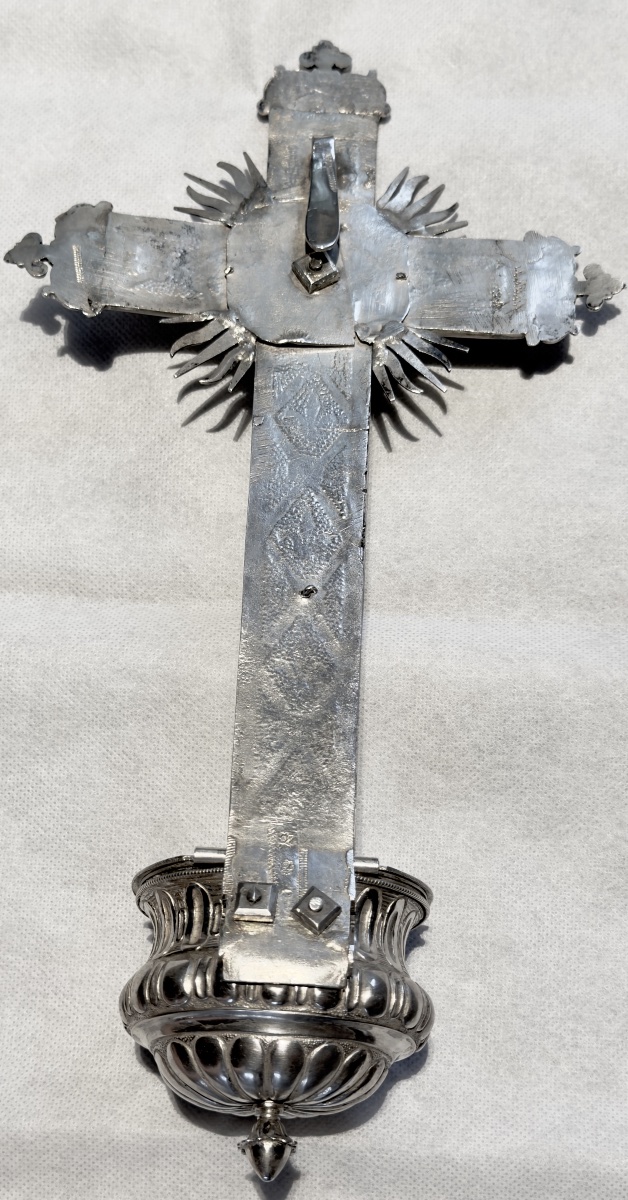
Intended for private devotion, it consists of a large cross bearing the figure of Christ, surrounded at the crossing by an imposing radiant glory, with a holy-water basin attached to the lower section. Its decoration combines several stylistic vocabularies. The gadrooned basin, fitted with a hinged cover, as well as certain elements of the engraved decoration, clearly anticipate the Louis XVI style. The arms and shaft of the cross have delicately stippled grounds, punctuated by lozenge-shaped compositions incorporating fleurs-de-lis, while the extremities retain a more animated ornamental vocabulary.
The design of the cross, and above all that of the figure of Christ, deliberately refers to a much older tradition. This type of crucifix, developed in the Southern Netherlands during the 17th century, remained highly popular until the end of the Ancien Régime.
Philippus Josephus Le Clercq was a native of Chièvres in Hainaut, where he was born the son of Jean Le Clercq. Having settled in Ghent, he was registered on 6 May 1762 as an apprentice to the silversmith Joannes Smidts. He completed his apprenticeship in 1765 and was admitted as a master silversmith in Ghent in 1770. He married Maria Joanna Josepha Courcelle, a native of Leuze, with whom he had at least two children, Petrus Josephus and Maria Theresia.
The Y-shaped Christ and the Flemish Baroque tradition
The most striking feature of the corpus is the position of Christ’s arms. Rather than extending almost horizontally to form a T with the body, they rise steeply and remain relatively close together, giving the figure its characteristic Y-shaped silhouette.
This iconography appeared during the early Baroque and found particularly important expression in the work of Peter Paul Rubens. During his years in Italy, Rubens studied the great masters of the Renaissance, including Michelangelo, whose figures in the Sistine Chapel provided important precedents for this powerful upward movement of the arms. The Christ with raised arms subsequently became an important formula within Rubens’s treatment of the Crucifixion.
The composition was taken up with particular distinction by the Bavarian sculptor Georg Petel (1601/02–1634), a contemporary of Rubens who was profoundly influenced by his work. Petel produced several ivory figures of Christ employing this Y-shaped silhouette. The proximity of the arms also offered a considerable technical advantage to the ivory carver: it enabled the body and arms to be carved from a single elephant tusk, something considerably more difficult to achieve with a Christ whose arms were widely outstretched.
Petel also contributed to the popularity of another feature that was to enjoy considerable success: the perizonium secured by a cord, its drapery leaving one of Christ’s hips largely exposed. This treatment enhances both the verticality and the anatomical naturalism of the figure.
The model subsequently gave rise to numerous variations in 17th-century Flemish and European sculpture, notably in the work or circle of François Duquesnoy, the Flemish sculptor established in Rome, and of the important Antwerp sculptor Matthieu van Beveren (c. 1630–1690). The Louvre, for example, preserves a figure of Christ derived from a prototype attributed to Duquesnoy, distinguished by its elongated body and strongly raised arms.
Christ on the Cross after François Duquesnoy in the Louvre collections
This artistic genealogy also calls for some caution regarding the traditional term “Jansenist Christ”, long used in the art trade to describe these Y-shaped figures. The narrow position of the arms was sometimes interpreted as an expression of the Jansenist belief that salvation was accessible only to a small number of the elect. This interpretation, however, is both late and historically questionable: the iconographic type predates Jansenism, since examples by Rubens and Petel appeared before the publication in 1640 of Cornelius Jansenius’s Augustinus. It therefore seems preferable to describe the present figure as a Y-shaped Christ in the Flemish Baroque tradition, rather than as a Jansenist Christ.
Openbaar Kunstbezit Vlaanderen study on Georg Petel and Rubens
Thus, in 1775, Le Clercq was employing an iconography already more than a century old but still appreciated in the Southern Netherlands, incorporating it into an object whose decoration otherwise belongs firmly to the taste of the second half of the 18th century.
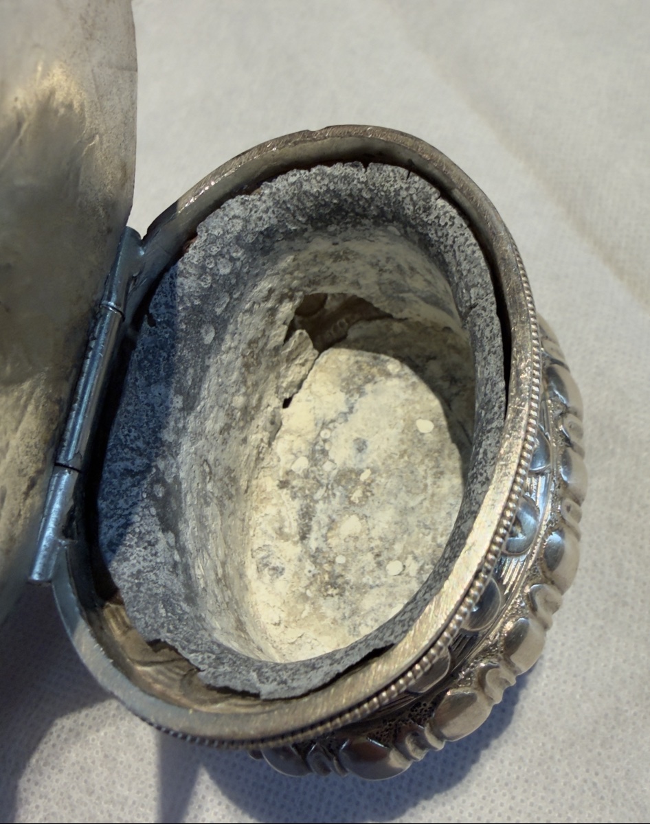
The holy-water font retains its original pewter liner, intended to contain the holy water. Although now considerably deteriorated, its survival is an interesting testimony to the integrity of the object. The engraved decoration of the silver itself, by contrast, remains particularly crisp and well preserved.
The reverse also retains, in several places, characteristic zigzag assay traces, or silver test scrapes — traditionally known in Belgium as “striche”. These marks resulted from the removal of a minute quantity of metal in order to test the fineness of the silver and provide valuable evidence of the methods used to control precious metals under the Ancien Régime.
The ensemble therefore constitutes a remarkable example of Ghent religious silver from the late 18th century: an object Louis XVI in date and in part of its ornamentation, while deliberately looking back, through its Y-shaped figure of Christ, to the prestigious Baroque iconographic tradition developed in the Southern Netherlands during the 17th century.
Period: 18th century
Style: Louis 16th, Directory
Condition: Excellent condition
Material: Sterling silver
Length: 28 cm
Width: 15 cm
Depth: 5 cm
Reference (ID): 1813978
Availability: In stock